Why Do My Printed Borders Look Uneven? Understanding Cutting Variance
If you’ve ever designed a beautiful business card or flyer with a crisp, uniform border, only to have it printed and notice the border looks slightly off-center, you aren’t alone. It’s a common frustration in the printing world.
But don’t worry, it’s not a glitch in your design software! It all comes down to a perfectly normal physical process known as cutting variance. Here is a quick breakdown of why this happens and how you can easily prep your files to avoid it.
The Culprit: The Reality of Cutting Paper
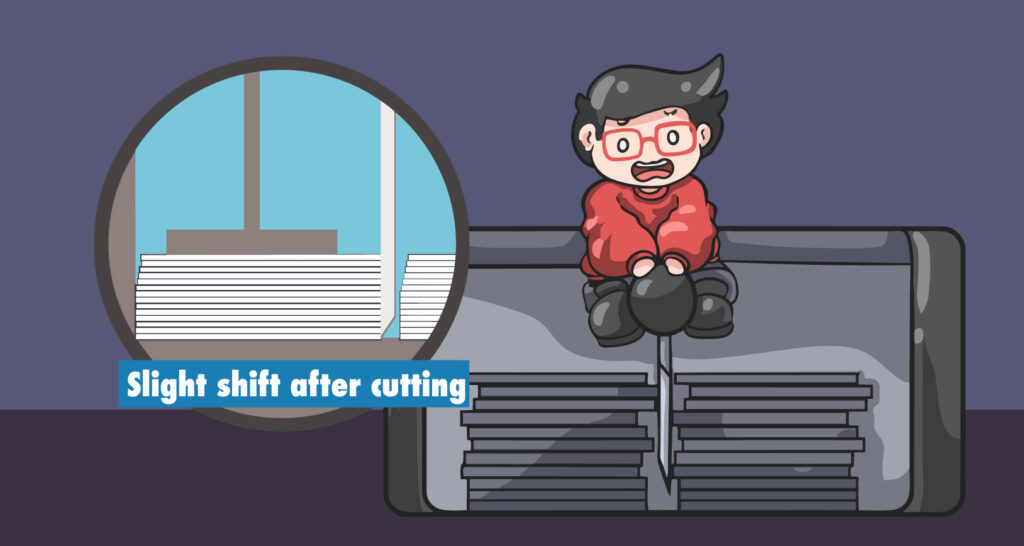
To understand the problem, we have to look at the cutter. Commercial printers don’t cut sheets of paper one by one.
The Stack: We cut your orders in thick stacks to ensure efficiency.
The Blade: We use a heavy-duty, wedge-shaped guillotine blade to slice through these stacks.
The Shift: Because the blade is wedge-shaped, the sheer physical pressure naturally pushes the paper stack down and outwards as it cuts.
The Result: This pressure creates a perfectly normal “cutting shift” (or variance) of up to 1/32″ (about 1mm).
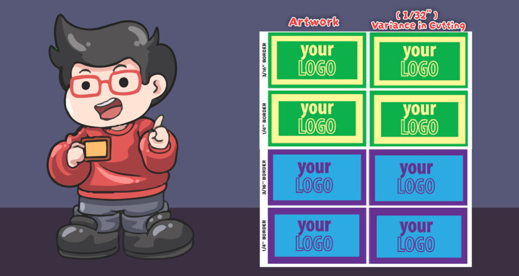
The "Thin Border" Trap
You might be thinking, “1/32 of an inch sounds tiny, right?” It is tiny—unless your design relies on a very thin border. If your artwork uses a 1 pt, 1/16″, or 1/8″ border, that tiny 1/32″ shift becomes incredibly obvious.
A slight variance can make a very thin border look twice as thick on one side compared to the other. Suddenly, your whole design looks completely off-center and uneven!
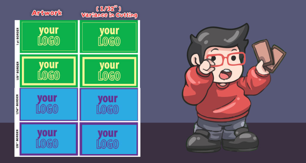
Thick Borders Hide the Shift
The good news? You can easily outsmart the cutting variance by simply making your borders thicker. Thicker is always better!
When you use a thicker border (like 1/4″ or 3/16″), that exact same 1/32″ cutting variance still happens, but it becomes basically invisible to the human eye. The thicker the margin, the safer your design is from looking lopsided.
How to Prep Your Files: Our Golden Rules for Borders
To ensure your final printed products look flawless every single time, follow these simple guidelines when setting up your artwork:
❌ AVOID: Thin borders (1 pt, 1/16″, or 1/8″). They are risky and will highly exaggerate normal cutting shifts!
✅ SAFE: Use thick borders of at least 1/4″ (0.25 inches). This provides enough visual cushion to hide any natural cutting shifts.
🏆 SAFEST: No borders at all! The best way to avoid uneven borders is to extend your background color or image all the way off the edge of the design (a process known as adding a Bleed). This guarantees a flawless, edge-to-edge finish every time.